Five Visual Poems
“Verge”

“Sought”

“Realigned”

“I Had Another Dream about You”
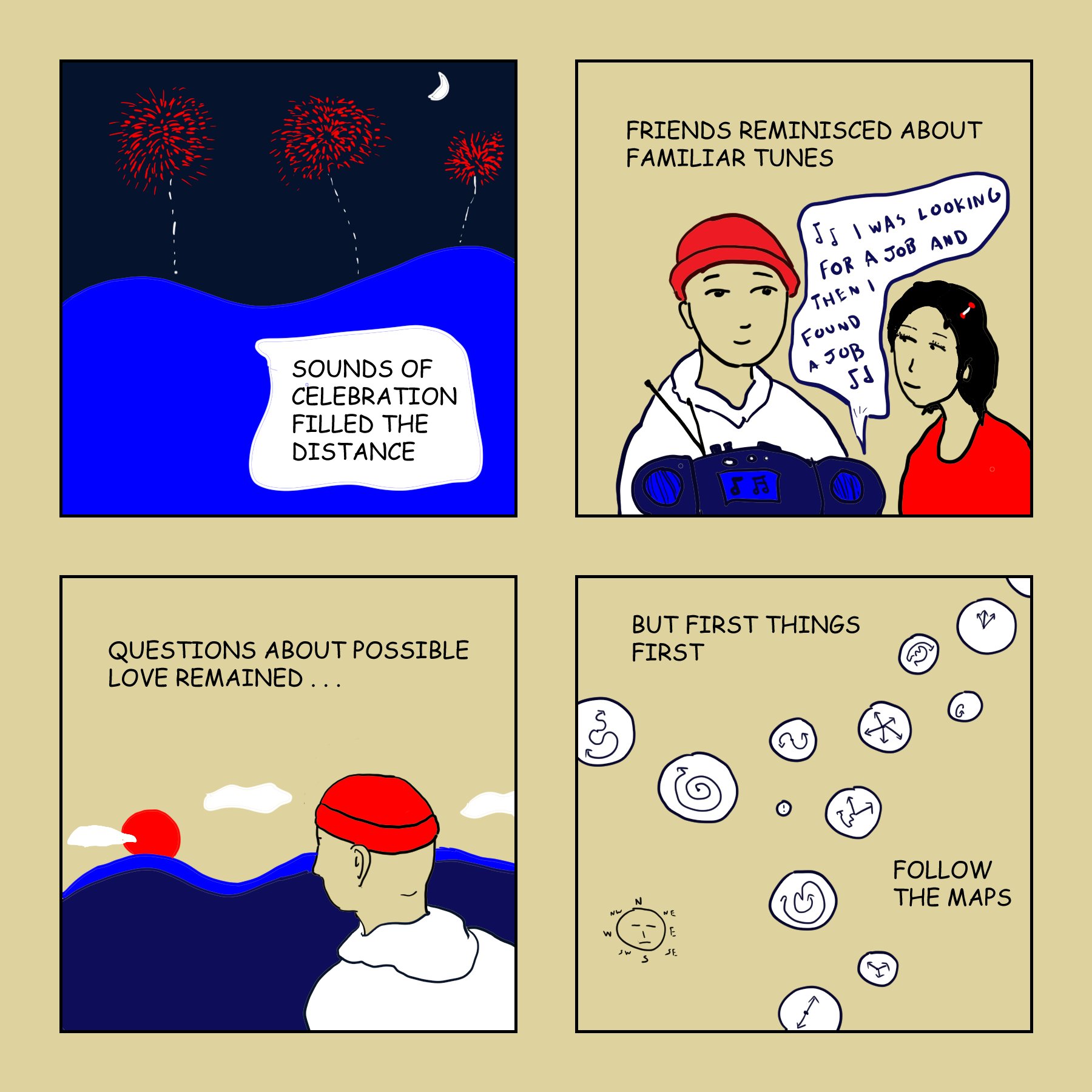
“Reprise”

Joe DeLong’s visual poetry has appeared in The Adroit Journal, Permafrost Magazine, and Redactions. He’s the author of How We Measure (Finishing Line, 2021), a full-length poetry collection. His other publications include literary scholarship and translations (with Noriko Hara) of contemporary Japanese poet Ken’ichi Sasō. He has an MFA in literary translation from the University of Iowa and a PhD in English from the University of Cincinnati, and he teaches in the Case Western Reserve University Writing Program.
Former Associate Editor Scott Adiconis talks with Joe about his work.
Scott Adiconis: Can you tell us about your journey from studying English literature to creating visual poems? How did your academic background influence your creative work?
Joe Delong: Growing up I loved to draw. Comic strips fascinated me too, and I liked learning about the history of the genre all the way back to cartoonists like George Herriman and Richard Outcault. For a little while in college I was even studying to be an art major, but then I switched to English, which ended up leading to a master’s degree in poetry and a PhD in English literature. Occasionally I’d still get the urge to dabble in art, but usually that passed quickly.
The artistic urge resurfaced around the start of 2018, and for whatever reason it took a stronger-than-usual hold of me. I started experimenting with new techniques and a variety of media—markers, oil pastels, acrylic gouache, etc. What stands out about that time was how creative and free it felt, probably because I resisted placing too much pressure on myself to feel like I needed to achieve anything in particular.
That being said, I was still aware that some literary journals accepted submissions in a category called “visual poetry.” I wrote poetry and made visual art, so why not explore the possibilities of combining them while I was at it?
After several months I’d developed a style I felt good about, and I decided I was ready to test the waters by submitting to a few journals. Less than three weeks later I received my first visual poetry acceptance! Needless to say, that encouraged me to keep going.
SA: You describe some of your comics as "visual poetry." Could you elaborate on what that means to you and how it manifests in your work?
JD: “Poetry” reflects the fact that artistry with the language remains important to me in this genre. I also want the “visual” component to form some kind of synergy with the language. My ideas for the text and image typically don’t arrive at the exact same moment, so it can require some patience for them to sync up, so to speak, but that’s also great because it’s as if the visual and poetic elements are in conversation and have something to teach each other.
Honestly, other labels could apply to my work too. The broader category of “hybrid” work and the narrower category of “poetry comics” both fit. However, “visual poetry” is how I myself thought of what I was trying to create early on, so in a very real sense that term helped shape my work and my sense of its possibilities, and it continues to feel like the most natural fit.
SA: Outside of your own work, you've translated Japanese poetry. How do you feel translation has informed your creative process?
JD: I’m a big advocate for literary translation, and one reason is that it’s tremendous for cultivating skills that carry over to other genres of writing!
It can be hard to see just how creative an act literary translation is—and needs to be—until you experience it for yourself (which was true for me). As the ancient translator Jerome pointed out, translating “word-for-word” has serious limitations. If you try to translate as closely to word-for-word as possible, the result can sound as awkward as what a translation app might produce. Literary translation requires (and helps you develop) the writerly resourcefulness to make creative adjustments, improving the quality of your work while still retaining enough of a relation to the source text to count as “translation.”
That sort of literary transmutation can be a very revision-intensive process. A translator’s first draft may differ dramatically from the final product. I certainly feel that revising my translations has made me a better reader of my own writing, as well as a more patient reviser.
SA: Your background also includes publishing a full-length book of poetry. How does your approach to poetry differ from your approach to storytelling in comics, and are there any common themes or techniques that bridge the two?
JD: My poetry can be both playful and meditative. Some of my poems contain elements of the mythic or fantastical. I’m open to eclectic subject matter, and, believe it or not, math has long been a significant source of inspiration for me (my poetry collection is called How We Measure, after all). To varying degrees, all of these things hold true for my visual poetry as well.
But there are some differences. In poetry, words do all the work and garner all the attention. In visual poems there needs to be a genuine partnership between text and image, so I can’t let my poet side completely take over. I admit I notice myself making somewhat different decisions with respect to word choice and tone. That being said, I still see my poetic and visual poetic practices as intimately related, and on a fundamental level they emerge from a shared sensibility. Mostly I compose the text for visual poems as a distinct process, but I have incorporated writing originally intended for poems into my visual poetry too, so there’s a degree of interchangeability.
SA: Could you discuss the role of color theory in your comics and how you use it to evoke emotions or enhance the storytelling experience?
JD: I’m intrigued by the visual impact you can achieve with a limited color palette. Vintage and vintage-inspired posters provide some good examples of just how striking this can look. The style I’ve arrived at consists of a parchment-colored background, with black, white, several types of blue, and mostly (but not exclusively) one type of red.
Parchment is a classic background color that feels mellower than white, as well as more tolerant of empty space on the page. I find blue flexible in terms of what I can depict with it, and different varieties of blue can coexist harmoniously. Red and white are my accent colors. Black works well for nuts-and-bolts things like facial features and text, and it can also create a vivid contrast with lighter colors.
I want the audience to see my visual landscape as welcoming and whimsical, with an undercurrent of the mysterious. I hope my color usage entices them to linger in this world and explore the interplay between its visual and textual elements.